Let us assume that you would like to represent the increase in pollen release over the period of a year. A colored identification could indicate weak, moderate and strong incidences.
Figure 6.63: Gauge with colored signal areas
Proceed as follows in the Sample Application:
1. The Gantt chart is an element in a report container. Therefore, you need to use the "Objects" tool window to insert this object. If you have not yet added a report container to the workspace, select Insert > Report Container (Objects > Insert > Report Container) and adjust the object to the desired size in the workspace while holding down the left mouse button.
2. A selection dialog will appear for the chosen element type. Select the "Gantt Chart" element type.
3. You can now select the data source in the following dialog. All available tables will be displayed hierarchically. In other words, you will find the related tables under each of the respective table. Select the "Pollen" table.
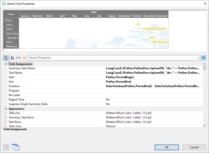
4. A properties dialog for the Gantt chart will appear.